Commodity Price Deflation? Not Likely
Chris Martenson takes a look at the case for falling commodity prices...
A FEW deflationists out there are calling for a top in commodity prices. Their argument is pretty clear cut: Because inflation is a function of available money plus credit (their definition), and because credit has fallen, deflation is what comes next, writes Chris Martenson.
When looking about for things to deflate in price, commodities are an obvious candidate for attention because they have risen so much over the past decade.
In this view, three things have to be true:
- Demand for commodities has to fall below supply. After all, as long as demand exceeds supply, prices will typically rise.
- Money, including credit that would normally be used to buy commodities, has to shrink. That's the definition of deflation that we're analyzing here.
- People's preference for money has to be greater than their preference for 'things,' with commodities being very obvious 'things.' That is, faith in money has to be there or people will prefer to store their wealth elsewhere.
These are all just versions of the old supply/demand argument for commodity prices, except that our consideration also includes the important element of the Austrian economic view of demand for money.
There are several reasons why I think there are serious holes in each of these conditions. Enough to warrant a healthy degree of caution in one's certainty about what 'must' happen next to commodity prices. Full disclosure: I continue to have 75% of my total net worth locked up in gold and silver, so I am decidedly in the camp that does not believe the commodity surge has yet run its course.
Before we tackle each of those three conditions from above, let's look at the chart for the Continuous Commodity Index (CCI) to see what it might be telling us.
First, let's examine the period after the great bust of 2008 (a liquidity-driven event) and note that commodities essentially rose during all of 2009 and then formed a classic 'bull flag' formation in early 2010.
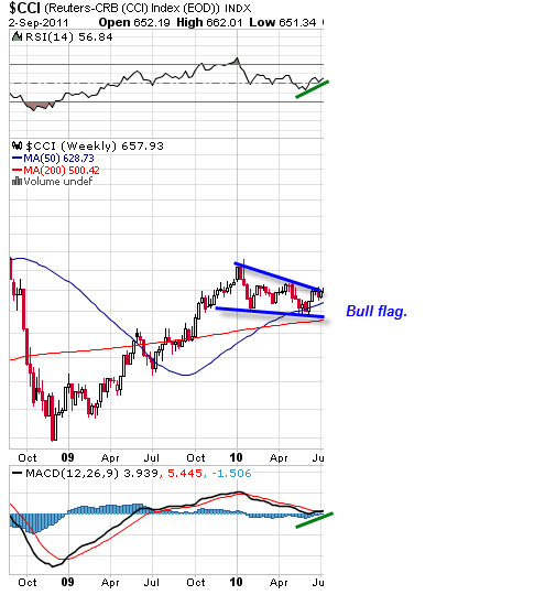
It should be noted that calls of commodity "topping" were also made at this time by several prominent deflationists. However, a topping pattern and a bull flag are very different beasts. So I was quite content to keep my calls for more commodity price increases intact at this time, even though they spent six months trending lower in this consolidating pattern, because the chart looked quite bullish to me.
And I was watching the near-daily Fed injections of thin-air money into the system, reading about surging Chinese demand, and tracking our negative interest rates at the same time -- all features that are supportive of higher commodity prices.
Note also in the above chart that the Relative Strength Index (RSI) on top was in neutral territory and rising (green line above) and that the momentum indicator (MACD) was also rising (green line below), both of which are typically bullish patterns. None of this was at all consistent with topping. It doesn't rule a top out, naturally, in trading and markets anything can happen, but these are not the usual signs one expects at a top.
Now let's expand the chart out and see what happened next:
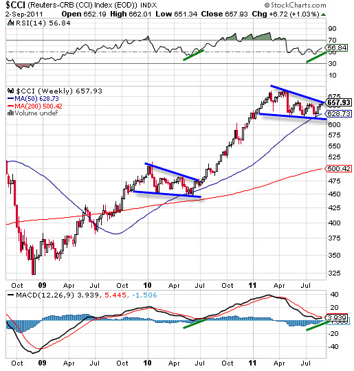
First, we might observe a 43% run-up in commodity prices over the next eight months following the bull flag we just dissected. Note that it is almost uninterrupted during the period from July 2010 to April 2011.
Second, we might ask ourselves what sort of a pattern we currently have in the commodity index chart. Rather eerily, because one rarely sees such a perfect repeat of patterns, what we see is another almost identical bull flag complete with rising RSI and MACD readings.
On the basis of these technical readings, I would be extremely cautious in making a call for commodities to spike down from here. Instead the chart is pretty clearly calling for another run to the upside. Again, this might not happen, and commodities could always fall from here, but a bet made in that direction is fighting a pretty powerful chart.
Now let's turn to the fundamental reasons that support the idea of a bullish commodities chart.
Condition #1: Supply Exceeds Demand
A key component of the deflation argument is that with credit shrinking, demand will drop, leaving excess market supply that resolves with lower commodity prices. Housing in much of the Western world, for example, fits this definition nicely. Too much was built while prices ran too high, and the bursting of that bubble is now resolving itself through lower prices.
Commodities have a long and storied history of boom/bust/boom, with supply and demand alternately racing past each other as the lag times for developing new supply assure too much at some point and too little at others.
What's new in this story today is the emergence of a couple of new economic powerhouses with billions of citizens as new participants at the resource table.
India is one of them, and the recent 'bad news' out of there was that the Indian economy only grew at 7.7% in the most recent quarter:
India's economy grew 7.7% in the three months from April to June, compared with the same period of 2010.
It was India's weakest growth for six quarters, but still better than had been expected.
The manufacturing sector grew 7.2%, an improvement from the previous quarter, but well below the 10.6% in the second quarter of 2010.
While the 7.2% growth in the manufacturing sector was downplayed in most articles in comparison to the prior 10.6% growth, it is useful to remember that a 7.2% rate of growth translates into a full doubling over just ten years' time. In other words, in ten years, India's manufacturing sector -- the one that consumes lots and lots of natural resources -- will be consuming twice as much of everything as it does now.
It is this massive rate of growth that is eating into the world's remaining resources and creating competition for most basic natural resources.
As big as India is, and as fast as its rate of economic expansion is, it is dwarfed by China on both counts:
SINGAPORE/BEIJING (Reuters) - UBS cut its 2011 and 2012 growth forecasts for China on Thursday to reflect weaker growth prospects in developed economies, saying the central bank may relax policy if the world's second-largest economy falters.
UBS now expects 2011 gross domestic product growth of 9 percent, down from its earlier projection of 9.3 percent. For 2012, it sees GDP growth of 8.3 percent, down from its previous forecast of 9 percent, it said in a report.
Again, while the emphasis in this article is on weakening growth, we should also be sure to note the absolute rate of growth here.
Global slump? What global slump? China is slated to grow its already huge economy by 9% this year (2011). If that rate of growth were sustained, China would double its economy in just eight years. Twice as much of everything would be consumed in just eight years.
When you are talking about 1.3 billion people doubling their intake of economic goods and services in just eight years, you are talking about the fastest absolute increase in demand placed on natural resources ever seen in world history. Faster and faster and faster; more and more and more.
What sorts of news items might we expect to accompany such a proposition? Perhaps some like these:
China's corn demand mindblowing
China's struggle to meet the growing demands of its middle class is fueling a sudden surge in demand for corn, sending vast ripples across the US farm belt and potentially upending the grain's trade flows around the world.
China's need for corn -- which forms the basis of sweeteners, starch and alcohol as well as feed for livestock -- was on stark display in July when the nation ordered 21 million bushels of US corn in one hit, more than the US government thought the country would buy in a year.
Corn prices, which have nearly doubled over the past year, climbed another 1% Tuesday.
China's appetite for oil imports increases
BEIJING, Aug. 15 (UPI) -- China's dependence on imported oil grew to 55.2 percent in the first five months of this year up from 55 percent last year, reports state-run news agency Xinhua, citing figures from China's Ministry of Industry and Information Technology.
In 2009, however, China's dependence on imported oil rose to 33 percent.
(Source)
China's Natural Gas Consumption Climbs 32 percent
Industrial Info Resources reports China's apparent natural consumption reached 11.1 billion cubic meters in July 2011, an increase of 32 percent from July 2010 and a 3 percent increase from June 2011, according to data issued by the General Customs Administration of China (GCAC).
As consumption increased, the import volume of natural gas also jumped from 15 percent to 25 percent over the same time period.
Securing uranium supplies still essential to China's energy security
China has 14 operational nuclear reactors and according to the World Nuclear Association, 77 more reactors are either planned or under construction with aim toward increasing nuclear capacity to 80 GWe by 2020, 200 by 2030 and 400 GWe by 2050.
However, the nation's domestic uranium resources don't even come close to the amount needed to fuel such an expansion. To secure uranium reserves, China has been aggressively moving to sign supply contracts and joint venture mining agreements as well as to purchase uranium mines overseas.
By 2020, China is expected to account for 20 percent of global uranium demand, according to Resource Capital Research.
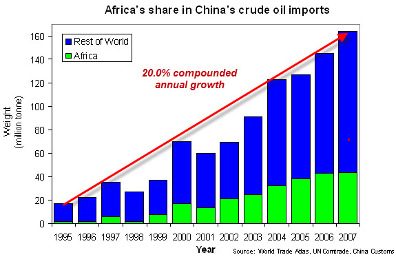
There are loads of similar articles covering China's aggressive expansion into Africa's resource plays, energy deals across the globe, and arable land where it is available. We're seeing exactly what you would expect from a major economy expanding like crazy: a rapidly growing, or, shall we say, exponentially increasing hunger for natural resources.
Perhaps a slump in the Western economies will suddenly flood the world with enough resources to cause a commodity crash, but perhaps not.
The supply-and-demand argument rests on the time-tested notion that with increased demand, new supplies are brought to market. This has more or less always been true, although astronomical prices will not get you a passenger pigeon and rising prices seem unable to drag more giant Bluefin Tuna from the seas. The point there is that the usual supply and demand argument falls apart in the presence of limits.
Jeremy Grantham, who previewed my book last fall and provided a blurb for its jacket cover, has been all over the news lately talking about a profound structural shift in natural resources:
Grantham concludes that the world has undergone a permanent "paradigm shift" in which the number of people on planet Earth has finally and permanently outstripped the planet's ability to support us.
Specifically, Grantham says, the phenomenon of ever-more humans using a finite supply of natural resources cannot continue forever--and the prices of metals, hydrocarbons (oil), and food are now beginning to reflect that.
In other words, Grantham says, it is different this time.
Grantham believes that the trend of the last 100 years, in which the prices of almost all major commodities have steadily declined, is permanently over. And from here on in, humans will be competing more--and paying more--for ever-scarcer resources.
From a societal standpoint, the news is far worse. Grantham believes that the planet can only sustainably support about 1.5 billion humans, versus the 7 billion on Earth right now (heading to 10-12 billion). For all of history except the last 200 years, the human population has been controlled via the limits of the food supply. Grantham thinks that, eventually, the same force will come into play again.
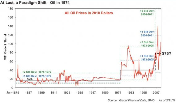
Instead of oil being in a spiked-top formation ready to fall back to its prior range of $20-$30 a barrel, Grantham argues that oil has shifted to a new price level. I have argued the same thing, not by using price charts, but through the fundamental analysis of oil supply in the context of Peak Oil coupled with an understanding of the marginal cost of producing a new barrel.
If it costs $70 - $80 to produce a new barrel of oil, the price cannot fall much below that for very long.
So on the first deflationist point that supply of commodities will soon greatly exceed demand, I have to conclude that until and unless we see China's and India's economies fall off a cliff, the impact of bringing an additional 2.5 billion consumers to the global buffet of natural resources will provide ample pressure to prevent a sustained crash in prices. Perhaps we'll experience a short-term correction, especially if the Fed is stingy with its still-unannounced QE III program, but a long-term crash seems highly unlikely.
Condition #2: Money Plus Credit Shrinks
The second key deflationist assumption is that the supply of money plus credit will decrease. Central to this argument is the idea that it's insufficient to track the money supply alone and that it's essential to include the expansion (and/or contraction) of credit as well. This makes sense on the surface, because credit allows people to buy things and buying can translate into price pressures. More credit means more buying pressure; less equals the opposite.
But I have a number of difficulties with this view over the long-term. (Hey, credit has to be paid back at some point, right? So it's roughly neutral over the long haul.) This explanation is especially problematic for me when it is used in an overly broad way by lumping all credit market debt into a single spot and then saying, "There. Look. It's fallen. Credit is down, and that's deflationary."
The trouble I have with this view is that not all credit has the same impact on demand. Some credit leads to demand that directly impacts the CPI (inflation), and some does not. When we are talking about inflation, what most people care about is the price of things they use or consume (cars, food, gasoline, health care, houses, etc.), rather than financial instruments or paper assets (stocks, bonds, derivatives, etc.)
Let's put it this way: If you give someone a billion Dollars in credit, it matters significantly whether they go out and buy ten thousand silos of corn or one twentieth of the next ten-year Treasury bond auction. In the latter case, nothing much happens to everyone else's inflationary experience, but in the former case, the price of corn goes up. A lot.
In other words, credit extended within and among the financial community mainly flows within and among the paper assets of the world, while non-financial credit goes to consumers, businesses, and governments that use the credit to buy real things.
[Note: One aspect of financial credit takes us to the world of shadow banking, where financial institutions and purely financially oriented participants buy and trade financial instruments generally just within and among themselves, often with tremendous leverage.]
Whether credit-default swaps (CDS), traded within and among the shadowy world of purely financially motivated entities, are trending up or down in price has almost zero impact on the price of molybdenum or corn. Therefore it is important for us to separate credit into its financial and non-financial components.
On this basis, if we look at total credit market debt broken out into its two main components (financial and non-financial), we see that instead of credit falling in general, it has fallen only in the financial world, but has climbed by an amount almost exactly offsetting it in the non-financial sectors:
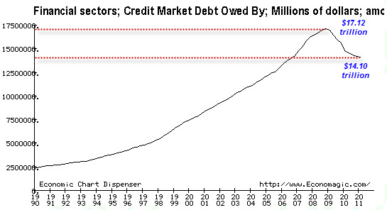
Yes, financial-sector debt has fallen by $3 trillion, and that is a drag on total credit market debt, but as explained above, we wouldn't expect this to have much of an impact on inflation for anything other than paper assets. Non-financial debt, on the other hand...
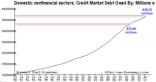
...has rather steadily climbed uninterrupted before, during, and after the Great Recession. Credit market debt within the physically consumptive portion of the economy has climbed by nearly $3 trillion, almost perfectly offsetting the non-financial decline. But the offset is just an interesting observation that really tells us nothing about the inflationary or deflationary effect of credit expansion/contraction on the things that are tracked in the CPI.
So on the basis of credit alone, I find the deflationary argument to be weak. There's been $3 trillion of new credit created in the consumptive portion of the economy since the start of the financial crisis in 2008, and it's almost entirely thanks to government borrowing. Not too shabby.
Turning to money itself, the deflationary argument becomes a lot more difficult to sustain. Money is measured by the Federal Reserve in various ways that are called the "M's." M1 is the narrowest version, representing cash in and out of the banking system and demand accounts (savings and checking) at the bank. Just look at M1 lately:
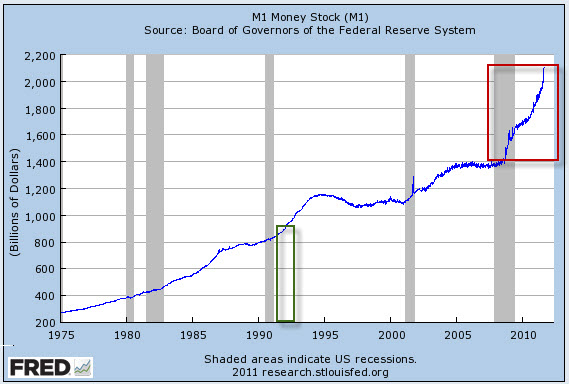
The increase in M1 since the start of the financial crisis (red box) is the same as the entire accumulated supply of money that existed in 1992 (green box). That is, as much M1 money has been created in the past three years as was created from the founding of this country through 1992.
It's really hard to square up that data with a deflationary argument. I have to assume that at least part of the reason for the big increase in M1 is people like you and me taking cash out of the bank, necessitating the printing and distribution of more cash.
M2 represents a slightly broader definition of money:
M2 includes a broader set of financial assets held principally by households. M2 consists of M1 plus: (1) savings deposits (which include money market deposit accounts, or MMDAs); (2) small-denomination time deposits (time deposits in amounts of less than $100,000); and (3) balances in retail money market mutual funds (MMMFs).
A chart of M2 reveals a steadily increasing rate of money creation that has been especially intense over the past few months:
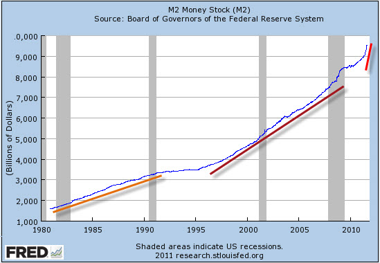
There is absolutely nothing deflationary in the M2 chart. It is exactly what we would expect to see from a culture that placed a man at the monetary helm on the basis of his promise (Jackson Hole, 2002) to run the printing presses if deflation came knocking.
Because M2 includes time deposits, which are generally locked up (in CDs and such) and therefore not immediately available for use, and it excludes institutional money funds (that might be used to buy things), it might not be the best indicator of money that can trot out of an account and create inflationary pressures.
For a better measure, I prefer MZM, or money of zero maturity, which includes institutional money funds andexcludes time deposits. Here's a chart of MZM:
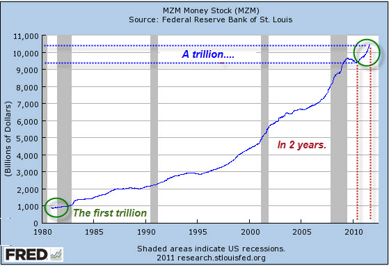
Yes, there was a little wobble downwards in MZM right after the end of the last recession, but over the past two years (red dotted lines), we note that a trillion Dollars in new MZM has entered circulation (blue dotted lines).
Again we might note that it took all of US history until 1982 to create the first trillion of MZM money stock, but only two years for the most recent trillion.


 Email us